Voyage: Leading Chalo’s first large scale design system
Powering 10+ public transport products
CONTEXT
Chalo, a fast-growing mobility startup, built 10+ products over the past decade for passengers, drivers, conductors, operators, and internal teams.
Rapid launches fueled growth but also left behind design debt, scattered styles, inconsistent interactions, and a fragmented brand identity.
As the team scaled, these gaps grew harder to ignore, so I took on the challenge of building a unified design system.
GOALS
Ensure brand consistency
01
while staying flexible for varied use cases
Enable
quick use
02
by designers, developers, PMs and marketers
Support all
products
03
in the Chalo ecosytem (mobile, tablet and web)
Promote
accessibility
04
for users of varied abilities and different contexts
MY ROLE
Project Lead
TEAM
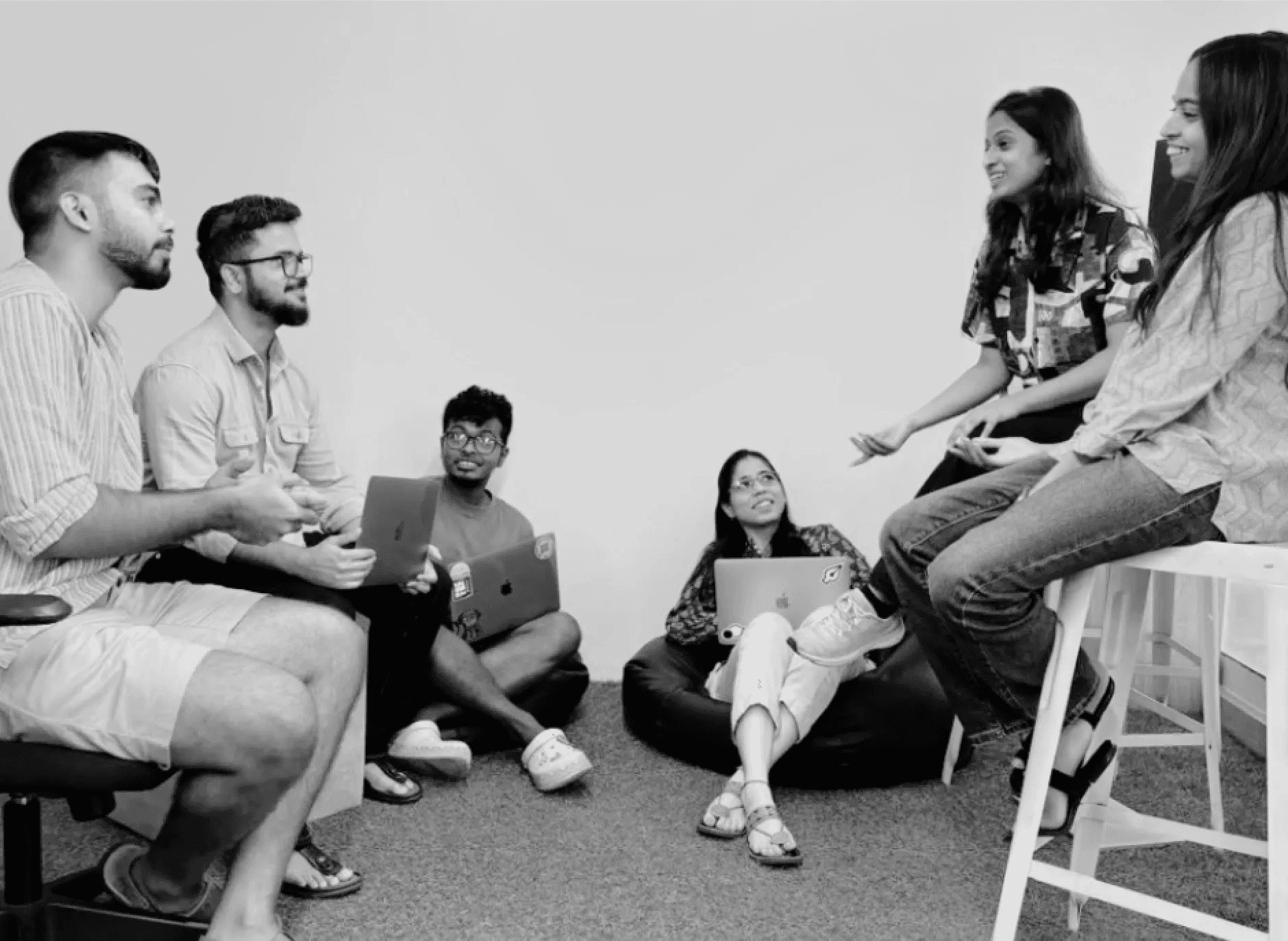
5 designers (collaborating closely with devs + PMs)
TIMELINE
4 months for V1
IMPACT
60%
reduction in design redundancy, eliminating duplicate styles & assets
75%
of new screens built using design system, reflecting adoption
40%
faster cycles, enabling quicker ideation, handoff & shipping
10+
products unified across mobile, web, and tablet
KEY CHALLENGE
How to build a system with no dedicated bandwidth?
With no full-time bandwidth, I designed a two-team weekly sprint model that allowed everyone to contribute without derailing core product work. We rotated teams often to avoid fatigue.
Team A:
Scouts
Audited and refined components, mapping out properties.
Team B:
Builders
Scaled refined designs into robust, reusable components using tokens & variants.
The pipeline:
Audit → build → deploy
Every Thursday, Scouts handed off 3 components to Builders, creating a continuous & practical workflow.
PROCESS STEP 1
Audit, Refine, Benchmark
We built a master checklist of all styles and components, pulling variations from Figma files across products. Each was refined by removing duplicates, aligning on flexible brand-consistent versions, and benchmarking against market and accessibility standards.
STEP 2
Clear "handoff matrix" for all components
Each sprint, Team A refined 3 components and handed them to Team B with a clear matrix of states, tokens, and usage rules, minimising back-and-forth and keeping the process efficient.

Handoff matrix for buttons
STEP 3
Building a comprehensive library with intuitive properties
We built style tokens (atoms), component variants (molecules), and templates for complex patterns like tables and bottom sheets. Each was annotated with guidelines.
Simple properties for fast experimentation
Mindful details to quickly adapt to context
Nested components for high flexibility
STEP 4
Adoption & rollout across products
As products entered research-driven revamps, we used each redesign as a natural entry point to introduce new components while systematically phasing out old ones, both in design and dev.


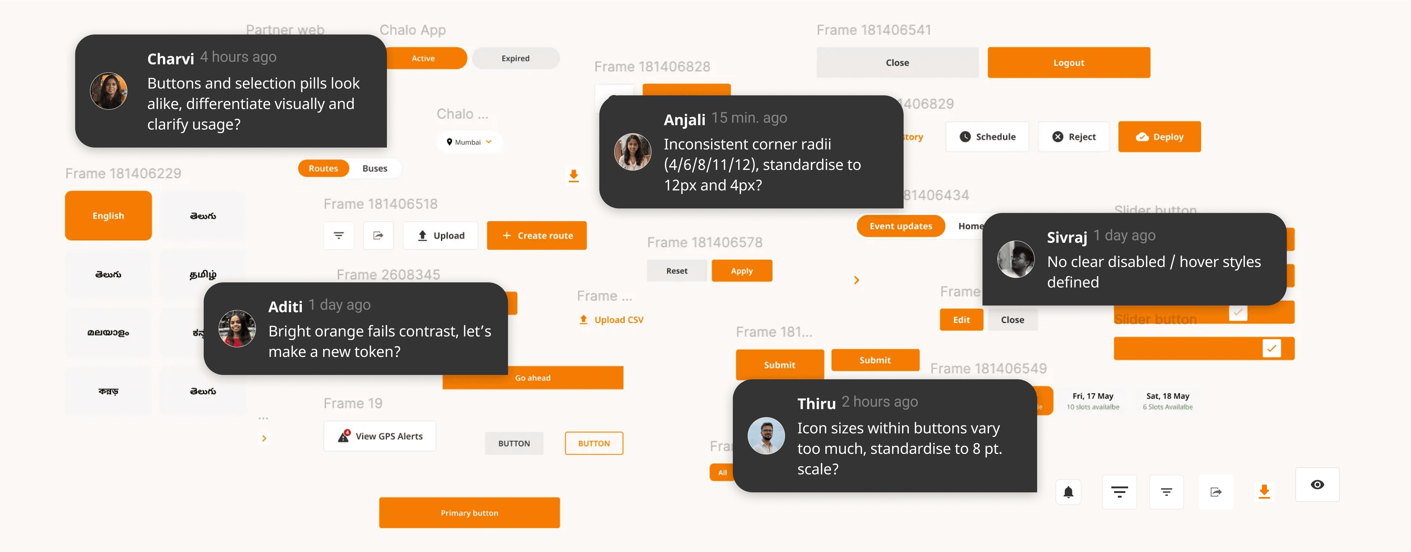
REVIEWS
Reviews and impact
Ratings from developers, designers and marketers reflected a significant improvement in ideation speed, design-dev handoff and implementation of consistency.

Aditi
OPERATOR APP DESIGNER
The design system has drastically reduced redundant work and allowed me to focus more on real user problems. It brought much needed structure to our design process.

Charvi
INTERNAL TOOL DESIGNER
Working with Anjali has been an absolute pleasure. The design system along with her UI reviews are thoughtful, detail oriented and she's always ready with creative & out of the box ideas.

Arif
MARKETING MANAGER
With Voyage, I can pull components that are already aligned with Chalo’s visual language. I love the consistency, whether it’s a ticketing screen or a festival banner, the look and feel ties back to the same system.

Deepak
PASSENGER APP DEV
Before Voyage, handoff meant endless back-and-forth to match spacing, tokens, and states. Now, ambiguity has reduced and our relationship with the design team is much smoother and less stressful.
STEP 5
Maintainence & future scope
A design system is never “done”, it must evolve with new requirements and scale alongside the company. We set up a dedicated Slack channel where designers, developers, and PMs could request components, suggest updates, and flag issues. We have continued our Thursday meetings to refine and innovate :)
We’re now shaping Voyage 2.0 to expand patterns and introduce delight through sound, motion, and micro-interactions, while refining guidelines and governance to keep adoption effortless.

REFLECTIONS
Participation drives adoption
The system succeeded because it was participatory, everyone was part of the building process. I learned that collective ownership and diverse inputs can make a system more intuitive, sustainable, and genuinely useful.
The hidden work behind speed
Small details, clear naming, consistent states, responsive components, built trust and confidence across teams. I learnt that attention to micro-interactions and documentation doesn’t just polish a system, it fuels speed, adoption, and long-term scalability.
Context shapes usability
We saw global design systems with endless components and properties, but copying & using them would have overwhelmed our fast moving team. Instead, we focused on our context, bandwidth, and users. Designers, developers, and PMs needed something lean, fast, and easy to adopt. The spirit was: start simple → fix fast → then innovate if needed. It reinforced for me that, like any interface, a design system must be iterative and designed for its users first.